
January 24, 2010
Popular car colors by country
I found a series of graphics showing car color popularity and rebuilt them in several stages. My goals were to increase readability, data density, and aesthetic appeal. I also created a more accessible web-based version.
The originals
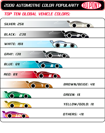
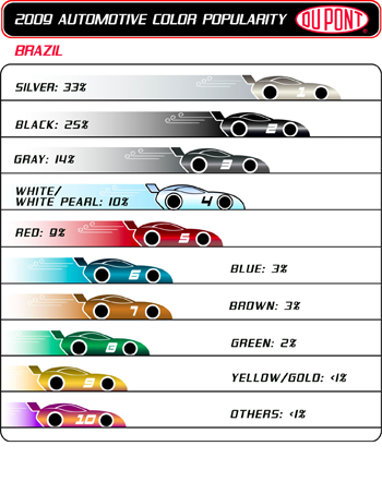
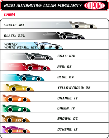
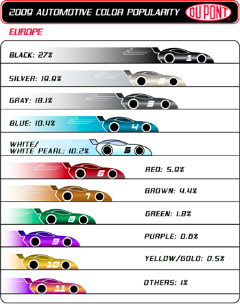
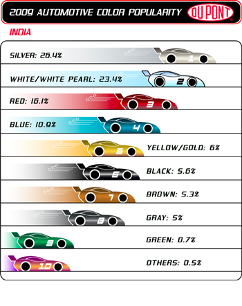
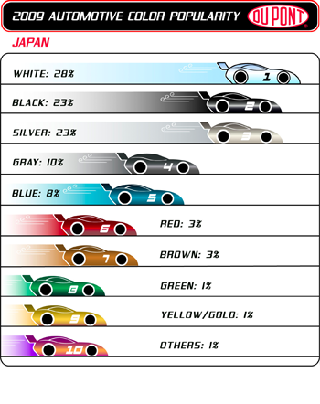
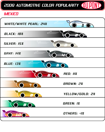
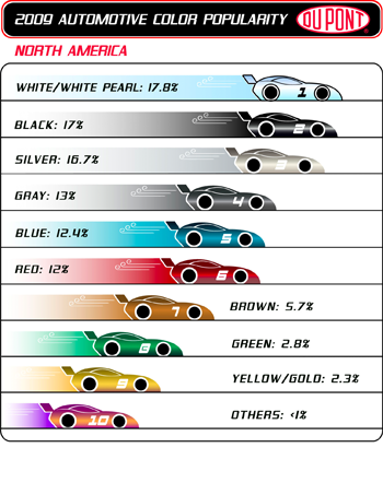
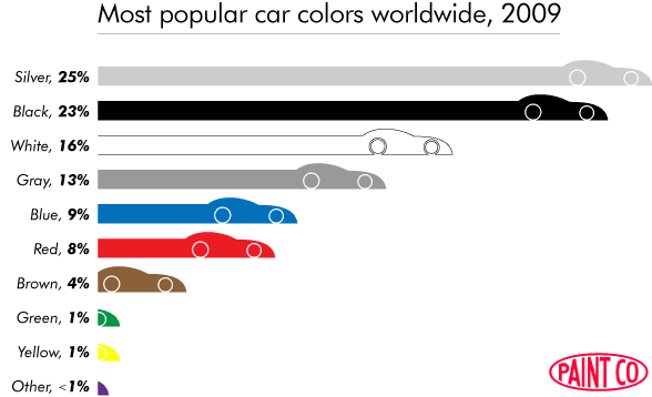
Each year DuPont publishes reports on global car color popularity. Their report for 2009 contains ten graphics, each showing a bar chart for a different region. Each graphic shows either ten or eleven colored bars, drawn as cars, with text labels for the color and popularity.
What’s right?
Even without reading the text, you could guess that these images are very likely about car color popularity; in this way it succeeds. In nearly every other respect this series of graphics is an ideal starting point for a lesson in what not to do.
What’s wrong?
The graphics are deceptive
This is the unforgivable sin of data graphics: to deceive the eye into perceiving incorrect information. Even if your graphic does not illuminate at very least it should do no harm.
No consistent scale is evident. For example, in the chart for world popularity, 8% red should be twice the width of 4% brown.

The scale changes between graphics: the Brazil’s 33% silver bar is the same width as the world’s 25% silver bar.

Also, the race car images greatly distort our perceptions. Take a quick look at the three images below. Of the two blue bar graphs, which looks most like the original in the center?
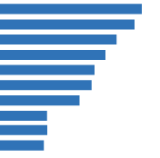
Even to me, moments after creating these images, the chart on the left most closely resembles the original. Yet we are deceived; the cars are not part of the data. Even taking into account the inconsistent scale, the blue chart on the right resembles the data much more closely.
Comparing countries is difficult
That 18% of new cars in Russia are green is trivia; that Russians appear to like green six times as much as any other country is interesting information. Often it is in comparison that data becomes interesting, and ease of comparison is a hallmark of good data visualization.
In this case, comparisons are made difficult by the use of multiple graphics and the inconsistencies between those graphics. Using another graphical page to display another dimension of data can be very effective, but small multiples work best when the graphics are clear at small sizes and changes from one to the other are instantly visible. Neither is the case here.
Ironically, color is poorly used
If graphics about car color get one thing right it should be color. Instead, each color is polluted by two gradients, one within the car and one in the car’s exhaust plume. These gradients are pointless and harmful, adding noise without aiding understanding.
There are many inconsistencies
For instance:
- Numbers are sometimes presented as integers and sometimes as decimals.
- Labels switch sides from left to right as the design runs out of room.
- Colors are listed in different orders on each chart.
We should not worship consistency for its own sake, but if our audience is to make effective comparative judgements they must have an anchor point. Non-data changes should be minimized or eliminated so that changes in data are visible.
The source data is hard to get
Nowhere on DuPont’s site can we find a simple presentation of all the data in plain text. Providing the source data is the best insurance against total communication failure. If your graphic doesn’t speak as well as you’d like or is laden with too many of your own assumptions, at very least your audience can read the source data and form their own conclusions.
The data
The first step to improvement is to get that data. Here it is, manually extracted from DuPont’s graphics.
| Silver | Black | White | Gray | Blue | Red | Brown | Green | Yellow | Other | Orange | |
|---|---|---|---|---|---|---|---|---|---|---|---|
| Brazil | 33 | 25 | 10 | 14 | 3 | 9 | 3 | 2 | 1 | 1 | - |
| China | 36 | 23 | 12 | 10 | 6 | 9 | - | 1 | 2 | 1 | 1 |
| Europe | 27 | 20 | 10 | 18 | 10 | 6 | 4 | 2 | 1 | 2 | - |
| India | 26 | 6 | 23 | 5 | 11 | 16 | 5 | 1 | 6 | 1 | - |
| Japan | 23 | 23 | 28 | 10 | 8 | 3 | 3 | 1 | 1 | 1 | - |
| Mexico | 15 | 18 | 24 | 14 | 13 | 11 | 2 | 1 | 2 | 1 | - |
| N. America | 17 | 17 | 18 | 13 | 12 | 12 | 6 | 3 | 2 | 1 | - |
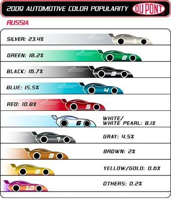
| Russia | 23 | 17 | 8 | 5 | 16 | 11 | 2 | 18 | 1 | - | - |
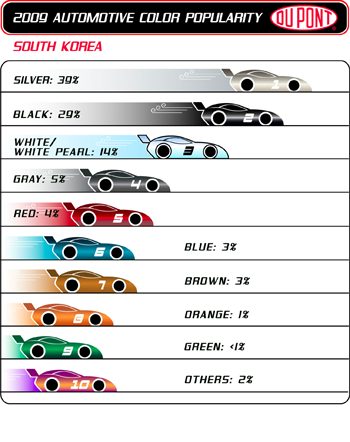
| S. Korea | 39 | 29 | 14 | 5 | 3 | 4 | 3 | 1 | - | 2 | 1 |
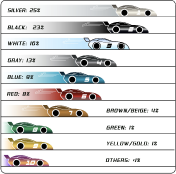
| World | 25 | 23 | 16 | 13 | 9 | 8 | 4 | 1 | 1 | 1 | - |
Angled lines mean Other
Already this is a vast improvement. All the data is presented at once so it’s easy to see relationships. It’s a more efficient use of space and no graphics are wasted. This is an excellent test for data graphics: if your graphic is less legible than a text table, consider a redesign.
But there are too many numbers here for quick comprehension. This is the perfect use case for a data graphic.
The refactor
It’s not difficult to improve one of these graphics. I built this to address my concerns with the display of a single country. It maintains as many elements from the original as possible, including the car shape and the oblique type (presumably used in the original because it looked speedy).
Other improvements to this graphic are possible, like a horizontal scale or better typography. Creating a full series for all countries would raise additional problems, like a consistent scale across countries, but we have bigger fish to fry.
One new graphic to rule them all
Improving the presentation of a single country is interesting and worthwhile, but it doesn’t address a fundamental problem with the original: the difficulty of comparing countries. That can be solved by building one graphic for all of the data.
In creating a new representation the first challenge is scale. The numbers range from 1% to 39%. The display of 1% must be legible, but if it’s too big the display of 39% (at 39 times its size) will make the chart very large. If I include text labels, the size of the text “1%” will dictate the size of the rest of the chart. I’ll try first without text labels for the colors.
I must include the country labels, though, and they are all much wider than they are tall; a graph that displays countries as rows will use space most efficiently. I’ll order the countries alphabetically and the colors by worldwide popularity, the same as the text table above.
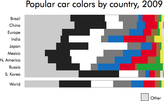
This is a bar graph made in Numbers. Any spreadsheet software should allow you to make a similar graph in just a few minutes once you have the data. This chart displays all the data in a fraction of the space. It nicely highlights both relationships and outliers, like India’s apparent affection for yellow.
Communicating with color
This is an improvement, but it has problems. It looks very noisy, in part due to the discontiguous river of white through the middle. The areas for “other” get lost at the edges. Red and brown and gray are of similar luminosity, and placing them so near each other makes for difficult reading.
Most important, it has no real voice. Ordering countries alphabetically and colors by popularity are both easy, obvious choices, but they don’t help the graphic communicate. Part of a designer’s job is interpretation. Can I find meaning in these numbers, meaning outside the default order, and help readers find it as well?
For me, the most interesting thing about this data is not the individual colors or countries, but that 100 years after Henry Ford’s famous adage the most popular colors are not colors at all, but shades of black. Is there a way to tell this story?
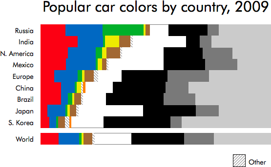
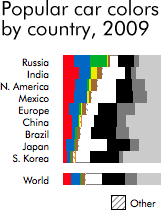
I’ve used white to separate colors from grays and placed the least popular colors at the inside of the chart next to white, so they won’t get lost at the edges. I moved the most visible color, red, to the edge where it’s least distracting, and placed next to it the most popular color: blue. Lastly, I ordered the countries by popularity of saturated colors.
This version is much improved. There are far fewer disconnected regions of color and thus less visual noise. Immediately it’s clear that the graphic tells a story: some countries like colorful cars better than others.
How small is too small?
 As an exercise, how small can this get before it’s useless? Shrinking the display of 1% to one pixel gives a chart 100 pixels wide.
This does feel very cramped, but look at how much information we still see! South Korea really likes silver and doesn’t care much for color; Russia likes colors, particularly green. We lose details, though, and small numbers are very hard to read.
The best of both worlds?
Now I have two refactors: a plain text table and a graphic chart. It should be possible to use CSS to combine these. The basics are simple enough: styling the table, tbody, tr, and td tags like blocks instead of table elements, and specifying a percentage width for each table cell in the markup.
The tabs below changes only one CSS class; the HTML content of the table remains the same.
| Red | Blue | Green | Yellow | Brown | Other | Orange | White | Black | Gray | Silver | |
|---|---|---|---|---|---|---|---|---|---|---|---|
| Russia | 11 | 16 | 18 | 1 | 2 | - | - | 8 | 17 | 5 | 23 |
| India | 16 | 11 | 1 | 6 | 5 | 1 | - | 23 | 6 | 5 | 26 |
| N. America | 12 | 12 | 3 | 2 | 6 | 1 | - | 18 | 17 | 13 | 17 |
| Mexico | 11 | 13 | 1 | 2 | 2 | 1 | - | 24 | 18 | 14 | 15 |
| Europe | 6 | 10 | 2 | 1 | 4 | 2 | - | 10 | 20 | 18 | 27 |
| China | 9 | 6 | 1 | 2 | - | 1 | 1 | 12 | 23 | 10 | 36 |
| Brazil | 9 | 3 | 2 | 1 | 3 | 1 | - | 10 | 25 | 14 | 33 |
| Japan | 3 | 8 | 1 | 1 | 3 | 1 | - | 28 | 23 | 10 | 23 |
| S. Korea | 4 | 3 | 1 | - | 3 | 2 | 1 | 14 | 29 | 5 | 39 |
| World | 8 | 9 | 1 | 1 | 4 | 1 | - | 16 | 23 | 13 | 25 |
Angled lines mean Other
This makes me happy, but it’s still improvable. What I like least is that for one color the difference between countries is not always easy to compare (especially, e.g., yellow). Since this is the web we have an interactive canvas, so I’ve added hover effects. If you move your mouse over any color bar all other bars of that color are highlighted. I’ve tried to make this more as discoverable as possible by triggering part of it with the tabs; I don’t consider it an ideal solution and hope to revisit it in the future.
The Point
This isn’t just a clever exercise. DuPont is a for-profit company. They paid someone to create these graphics and branded them with the DuPont logo; clearly they’re hoping for a return on their investment. If they created first-class data art more publications would use it. Instead, the originals are so poor that some feel compelled to redraw them or selectively sample them in order to communicate with their readers. This is a shame and a waste.